Understanding Your Tesla's Energy Charts
30 Oct 2021 • Savraj Singh
There are a couple charts on the “Energy” tab in the Tesla user interface. They’re packed with interesting info and I thought I’d take a minute to explain what’s going on.
First we’ll tackle the Consumption chart.
The X-Axis: “Miles ago”
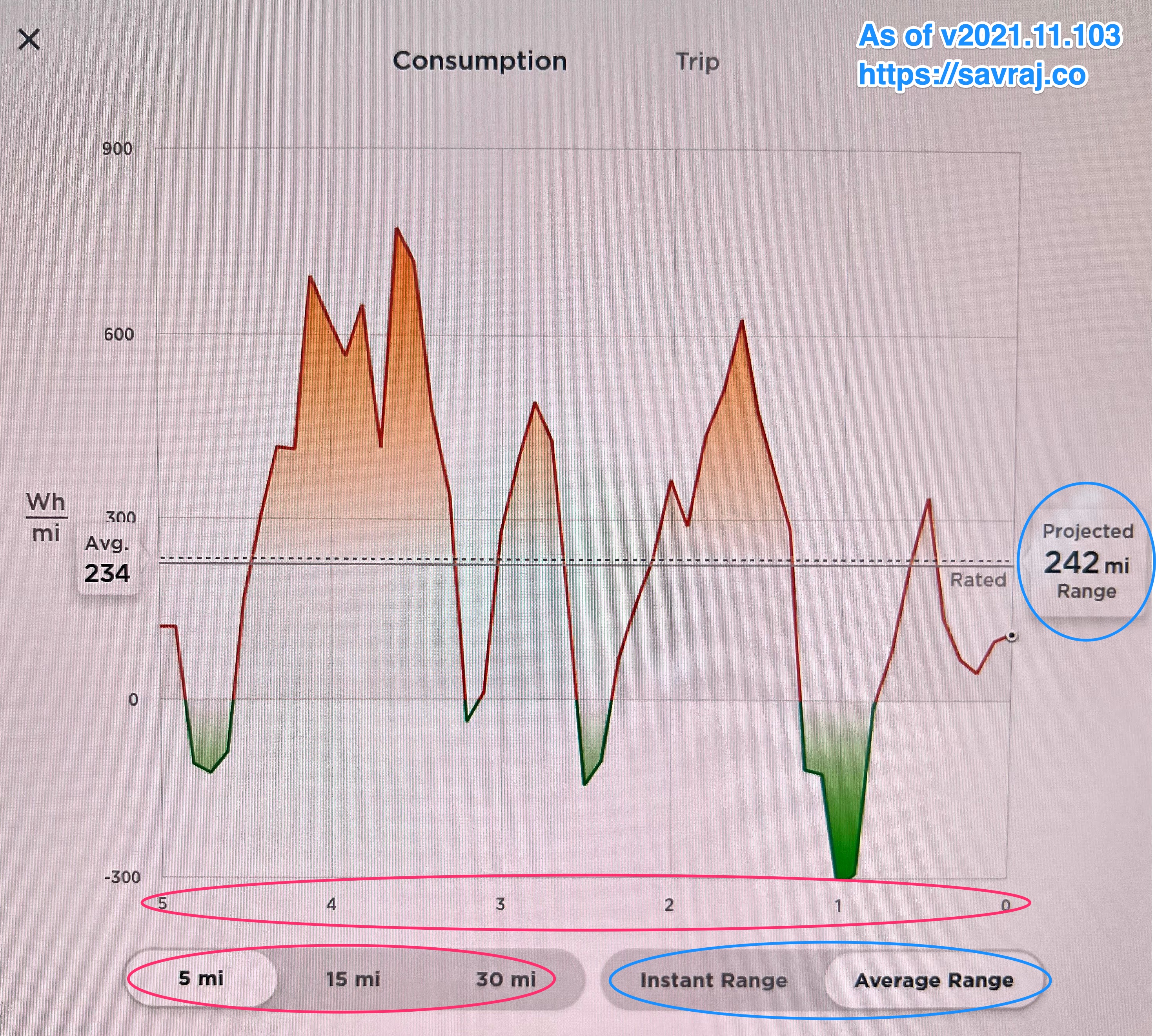
I’ve circled the x-axis and the x-axis ‘switcher’ in red. When you look at the x-axis, read the x-axis value and then say ‘miles ago’. So the line marked “4” is what was happening “4 miles ago.” All the way at the right edge of the chart is “NOW” aka “0 miles ago.” As you move left from the right edge of the chart, you’re going in to the past. You can see a maximum of 30 miles into the past with the “x-axis switcher” control.
The Y-Axis: “Energy Per Mile”
Think of the Y value as rate – that is, how fast you’re using energy. The rate you’re using energy is expressed as “energy per mile of travel” or “energy needed to go one mile.” We’ll get in to watthours later, but just think of them as an amount or quantity of energy.
Now let’s look at some points on this graph and see what they express. Find the the point at ~(x=4, y=600) – this point falls on the (admittedly jagged) line that makes up our chart. What that’s saying is “(4 miles ago, we were using 600 watthours per mile)”.
Another way to look at the y-axis: If you’re low on the y-axis you are being super efficient (when it goes negative, we’re actually charging the car’s battery), and if you are high on the y-axis, you are super inefficient. For example, on this chart, we have the point (1, -300) which means “1 mile ago, we were using -300 watt-hours per mile”. Again, that just means we were recovering energy from our forward motion. So at that moment, one mile ago, we were GAINING 300 watt-hours per mile of energy – we were charging our battery–instead of using energy.
It’s also important to realize that the (X, Y) point is a moment in time. So at point (4,600) – 4 miles ago we were using 600 watt hours per mile – but that moment was very short, as a mile later we found ourselves at (3, 300) – 3 miles ago we were using 300 watt hours per mile.
Does this chart ring any bells? It should, if you took Calculus…
Like any good calculus student, you would have recognized this chart by now. It’s actually the most recent segment of the first derivative of a different, easier to understand chart: miles traveled on the X-axis and energy used on the Y-axis. Remember math and stuff?
Solid Black Line: Rated Performance
For the Tesla Model 3, the solid black line is a “rated” value of about 225 watt-hours/mile. What that means is, your car, as created by Tesla, should use energy at this rate. This line is a fixed line – it’s not changing based on how you drive your car, as far as I can tell.
The Dashed Line: Average for the Chart
If you’re looking at the last 5 miles of data (as selected by the x-axis switcher control) the dashed line is your average of all the y-values (rates of energy consumption for the last five miles). If this chart has an overall goal, it’s to keep your dashed, average line below the solid, rated line. You can smile smugly to yourself when you achieve this, because it means your Tesla is getting better efficiency than its makers designed it for.
Wait, so what’s a WATT-HOUR?!
Ah, we finally got to my favorite topic. I can write about this for days. That’ll be my next post.